PGi — Enterprise Brand System & Global Design Framework

Role: Senior Manager, Creative Services
Focus: Brand Systems • Visual Identity • UX Alignment • Creative Operations

Overview

PGi’s brand had evolved over years of product growth, acquisitions, and distributed teams. While the company had existing brand standards, they no longer reflected the needs of a modern SaaS organization. Visual styles varied widely, UI patterns were inconsistent across product and marketing surfaces, and teams lacked a unified system that connected the brand to the upcoming GlobalMeet relaunch.

What the organization needed was a refreshed, expanded brand system that modernized PGi’s identity, clarified how UI and marketing should work together, and created a seamless companion framework to support the new GlobalMeet product direction. My role was to lead that evolution — aligning identity, design standards, and execution across all teams and surfaces.

Side-by-side comparison of the old PGi homepage with teal header and device collage next to the redesigned PGi/GlobalMeet page featuring the updated orange PGi logo, cleaner layout, and simplified hero content.
Before-and-after of the PGi logo and website, showing the shift from the legacy visual system to the refreshed PGi/GlobalMeet brand experience.

The Challenge

The Challenge

PGi’s brand had solid foundations, but the system wasn’t built to support the scale required for the GlobalMeet relaunch. UI patterns, marketing visuals, and regional assets diverged over time, and teams lacked a cohesive framework for aligning product and brand expression. A modernized system was essential before the new product narrative could succeed.

A unified system needed to:

  • Modernize PGi’s visual identity without losing the brand equity stakeholders valued
  • Introduce clearer UI standards that supported both product and marketing
  • Create scalable rules and reusable components for digital, print, event, and sponsorship surfaces
  • Support faster production cycles across global teams
  • Reduce agency dependence by channeling more work through in-house Creative Services using shared system assets and templates
  • Improve brand visibility and governance via a centralized brand hub, intake workflow, and self-service library built on the new system

A related challenge (explored in the GlobalMeet Product Identity case study) was establishing how PGi’s refreshed system should interact with the redesigned GlobalMeet logo and product brand. This required decisions about hierarchy and visual integration, which influenced—but did not dominate—this broader system.

Defining how PGi and GlobalMeet show up together — a clear logo hierarchy, co-branding rules, and real-world examples of when the master brand or product brand should lead.

My Role

As the senior creative lead, I was responsible for refreshing the corporate brand and operationalizing a unified design system across global teams. My role combined hands-on execution with light leadership: I mentored a junior designer who reported directly to me while partnering closely with product, marketing, and communications stakeholders.

Day-to-day, that meant modernizing the logo and color palette, refining the core visual language, developing new iconography and illustration styles, and establishing updated UI and marketing standards that both product and communications teams could align around.

I also designed and launched the PGi Brand Exchange—our internal brand hub for guidelines, assets, templates, and an integrated intake form that replaced scattered email requests. It became the central engine that connected global teams, increased visibility into work in progress, and streamlined creative operations.

PGi Brand Exchange screens—the centralized hub I designed and developed for brand education, asset downloads, and creative services requests, which helped drive global self-service adoption, increase visibility for brand governance, and increase creative intake volume.

The Solution

The final system brought cohesion, clarity, and modernized structure across PGi’s entire brand ecosystem. Key components included:

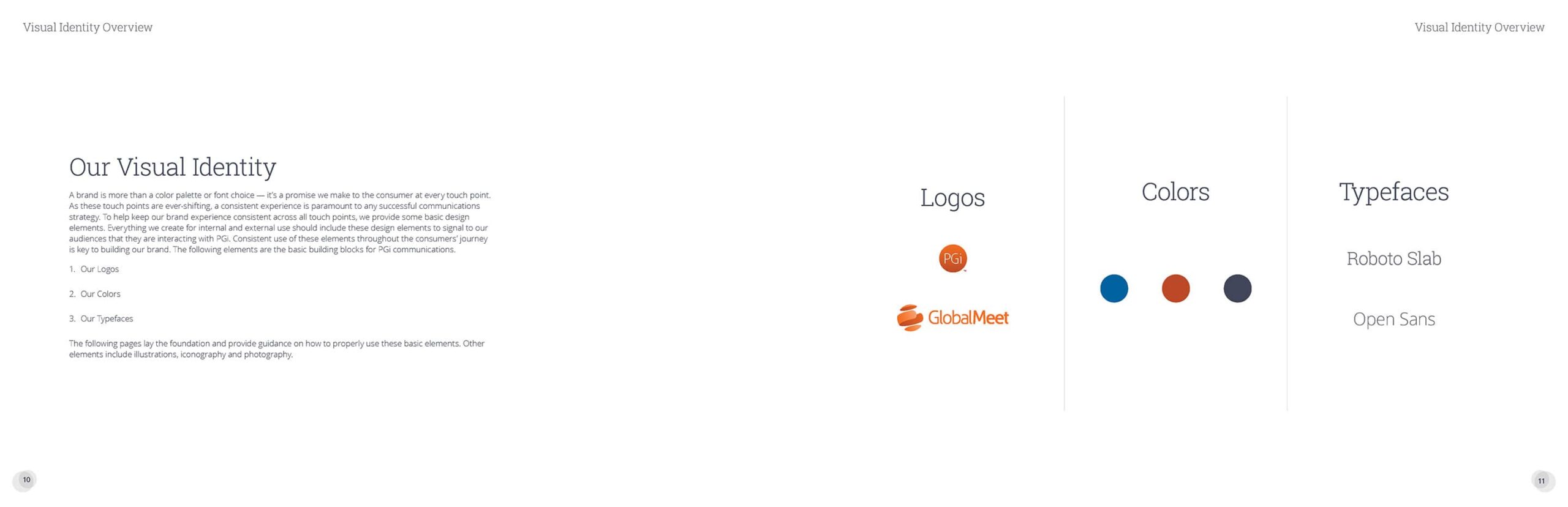
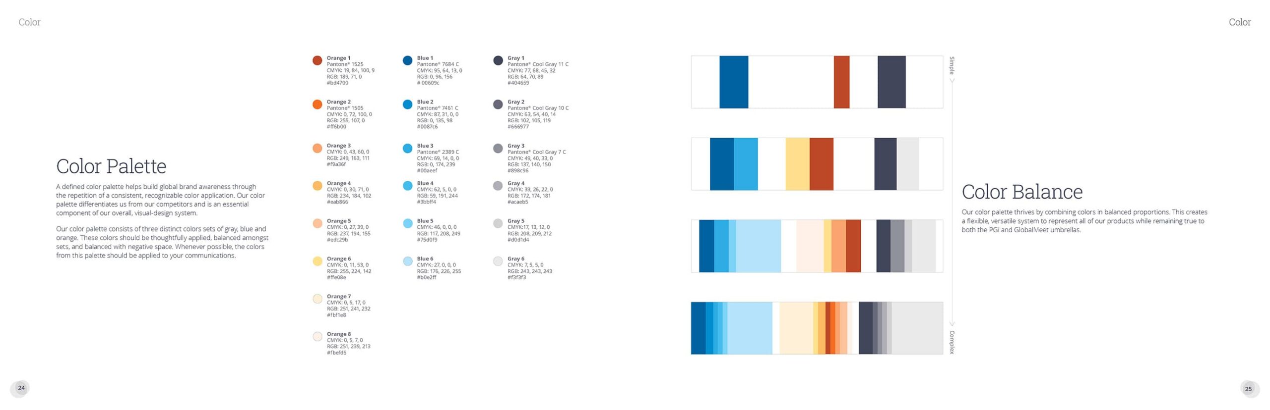
  • A refreshed and expanded identity system grounded in stronger typography, updated color, modern visual patterns, and clearer spacing rules
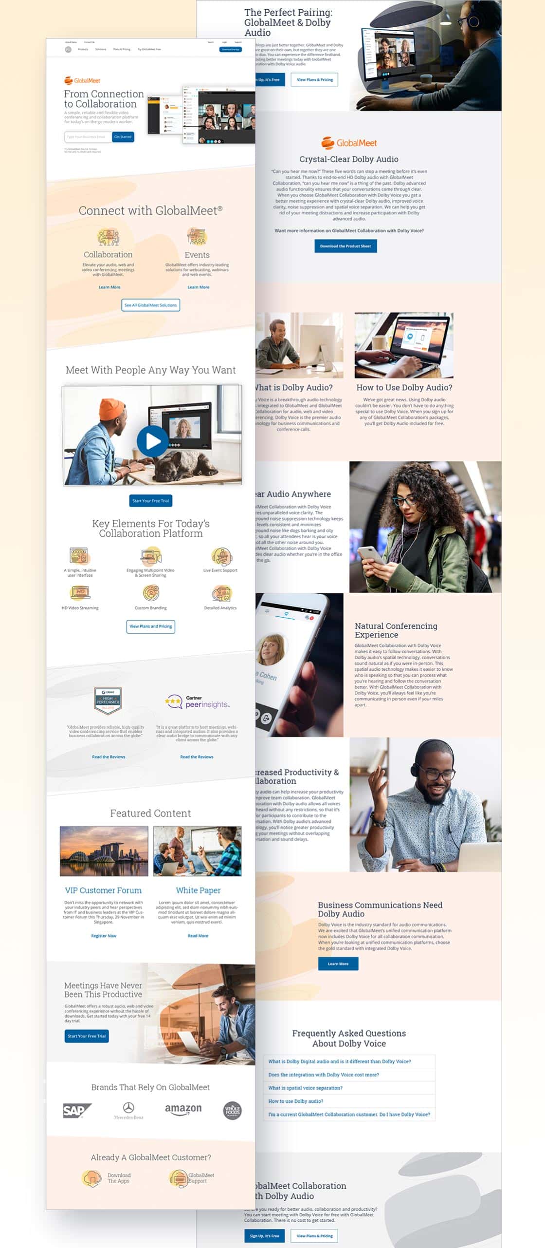
  • Unified standards for product UI, web, marketing, social, email, and campaign design
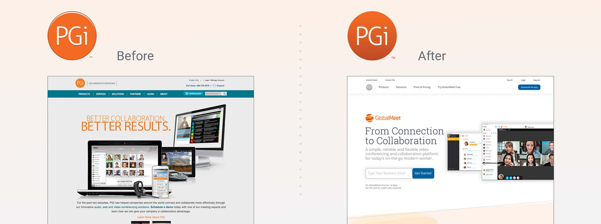
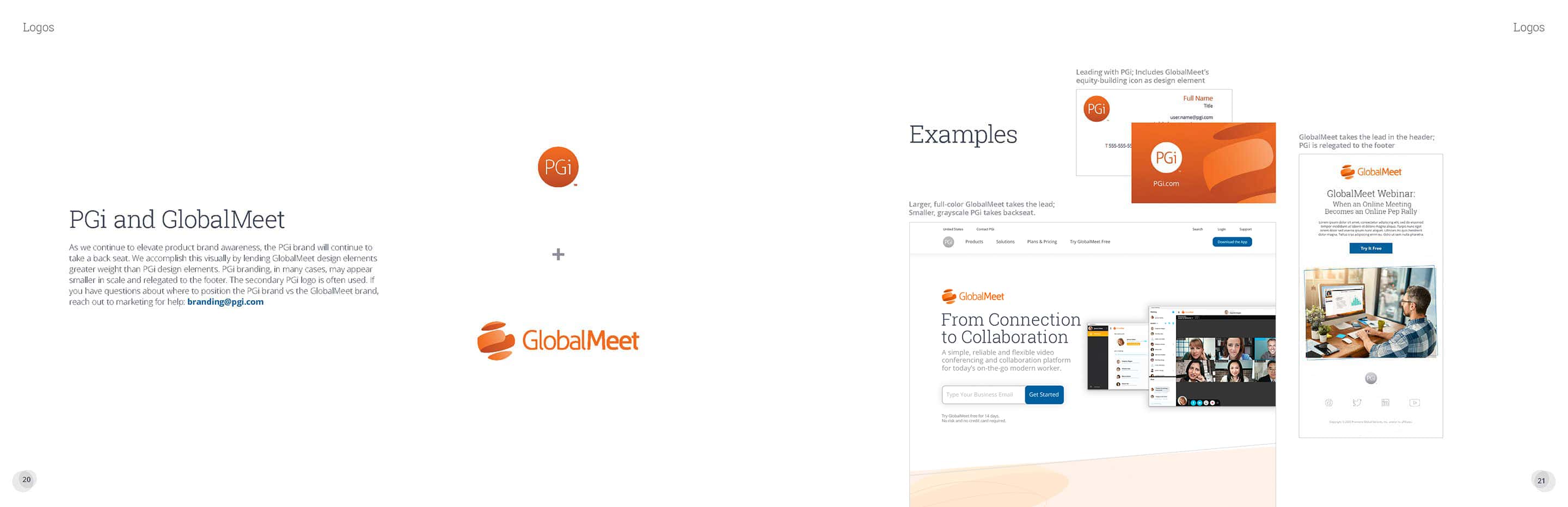
  • Updated brand architecture to define how PGi and GlobalMeet operated together across channels
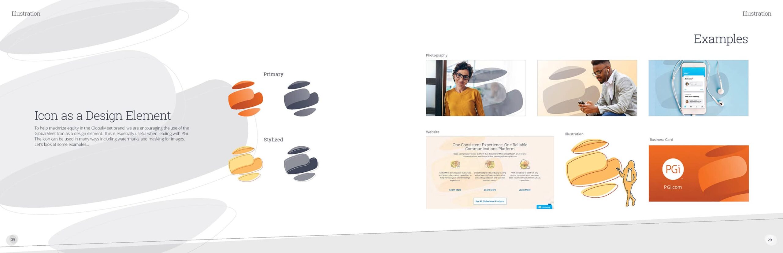
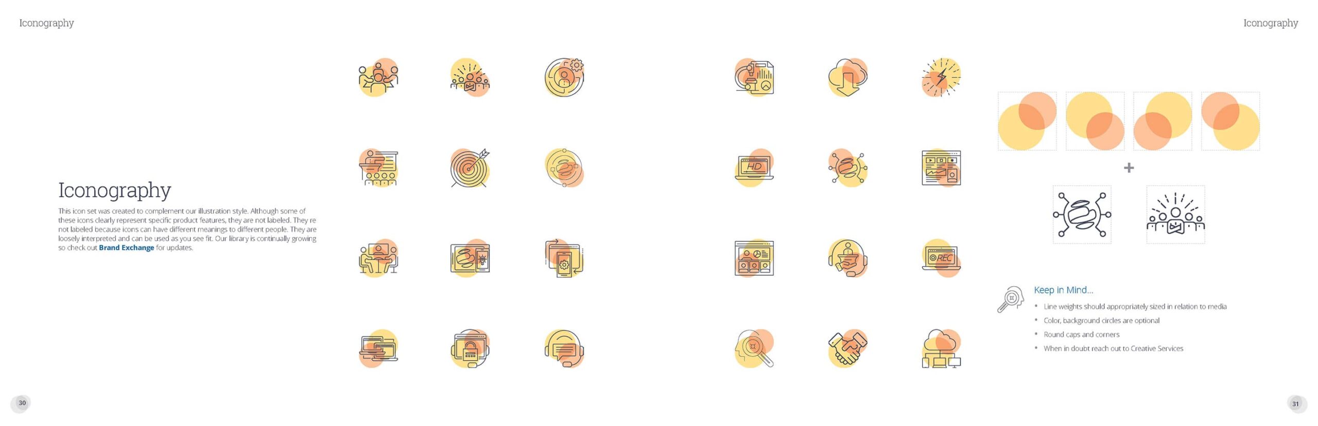
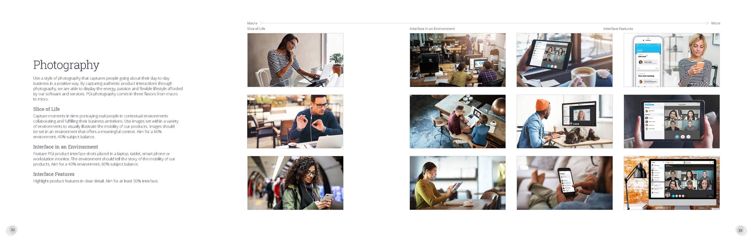
  • New photography, illustration, and iconography direction to create a consistent global look
  • A centralized Brand Exchange platform to distribute assets and manage creative requests

These components created a stable, scalable system that aligned corporate, product, and marketing teams—allowing the brand to move faster while maintaining consistency.

At-a-glance overview of PGi’s core visual identity building blocks—logos, primary colors, and typefaces.

Impact

The new brand system became the foundation for all PGi creative during my tenure, improving consistency, speed, and collaboration across regions and channels.

  • Marketing, product, and communications teams finally had unified tools, structure, and guidance to execute at a higher level.
  • Creative Services intake requests doubled after the launch of the Brand Exchange, with 27+ teams routing work through the platform and shifting more spend from external agencies to cost-efficient in-house support.
  • The system supported the modernization of PGi’s identity and laid the groundwork for the refreshed GlobalMeet product brand.
  • Production cycles accelerated thanks to clearer standards, reusable components, and self-service assets for common requests.
  • Global markets aligned around a shared visual language for the first time in years.

Overall, the updated system allowed PGi to operate with more clarity, speed, and brand governance—while driving measurable cost efficiencies and giving teams a modern visual foundation that could grow with the company.

Using the GlobalMeet icon as a flexible graphic element to build product equity while staying anchored to the PGi brand.
Standardized, flexible iconography system that extends the PGi + GlobalMeet visual language across products and channels.
A large grid of colorful PGi line icons, each in a consistent orange-and-yellow style, representing collaboration, analytics, devices, support, and other concepts for sales, marketing, and corporate communications materials.
Expanded PGi marketing icon library used across sales, campaigns, and corporate communications to visualize features, benefits, and workflows with a consistent style.
Integrated launch collateral — refreshed PGi.com homepage and product feature page.
Expanded color system showing how a simple core palette expands into richer, balanced combinations for a wide range of PGi and GlobalMeet applications.
Photography system ranging from people-first lifestyle moments to close-up product interface details.

A Better Browsing Experience

I use cookies to keep the site running smoothly and to understand how visitors interact with my work. See my Cookie Policy for more information.