Overview
GlobalMeet was PGi’s flagship SaaS platform, but its visual identity hadn’t kept pace with the product roadmap or the refreshed PGi corporate brand. The existing logo lacked flexibility, didn’t scale well in UI contexts, and wasn’t clearly connected to the corporate brand in a way that made sense for sales, marketing, or product teams.
Working alongside the broader PGi brand system initiative, I led the redesign of the GlobalMeet logo and its co-branding framework—creating a product identity that felt modern, scalable, and clearly tied to PGi while still standing on its own in product, marketing, and partner environments.
The Challenge
We weren’t just refreshing a logo. The new GlobalMeet identity needed to live comfortably alongside the PGi logo in decks, sales materials, and sponsorship assets, while still holding its own inside product UI, app icons, and small digital surfaces. It also had to support motion, UI, and campaign applications without falling apart under real-world constraints.
At the same time, we needed to untangle hierarchy and storytelling: when should PGi lead and GlobalMeet support? When is GlobalMeet the hero? How do we create a system that feels unified on a tradeshow wall, in a sales deck, and inside the product itself?
This case study focuses on the product logo and co-branding system. The broader corporate framework is covered in the PGi — Enterprise Brand System & Global Design Framework project.
My Role
I led the end-to-end redesign of the GlobalMeet logo and its integration into the PGi ecosystem—from early exploration through final specifications and rollout.
That included partnering with product, marketing, and executive stakeholders to define requirements and success criteria, exploring visual directions that honored PGi’s heritage while giving GlobalMeet its own momentum, and testing the mark across real use cases such as product UI, decks, sponsorship assets, and motion. I documented usage rules and co-branding patterns in the PGi Visual Identity Guide and collaborated with a junior designer and motion partner to extend the identity into lower thirds, title cards, and event deliverables.
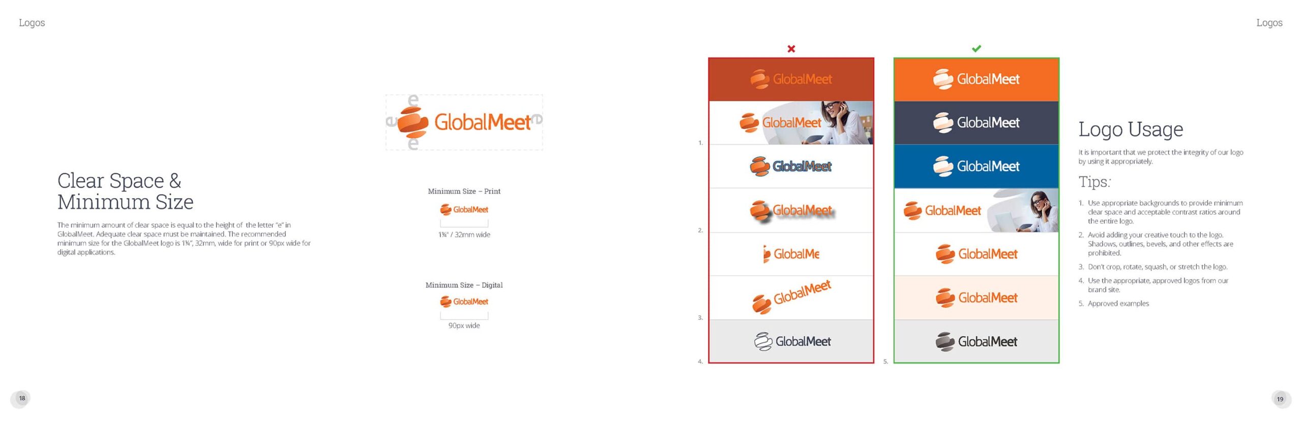
Design Goals
From the start, the identity was built around a few simple principles: it needed to be clear at any size, coherent with PGi without feeling like a generic sub-brand, flexible enough to animate cleanly in motion, and ready to plug into real systems—decks, product surfaces, one-pagers, and sponsorship environments—without constant redesign.
Process & Key Decisions
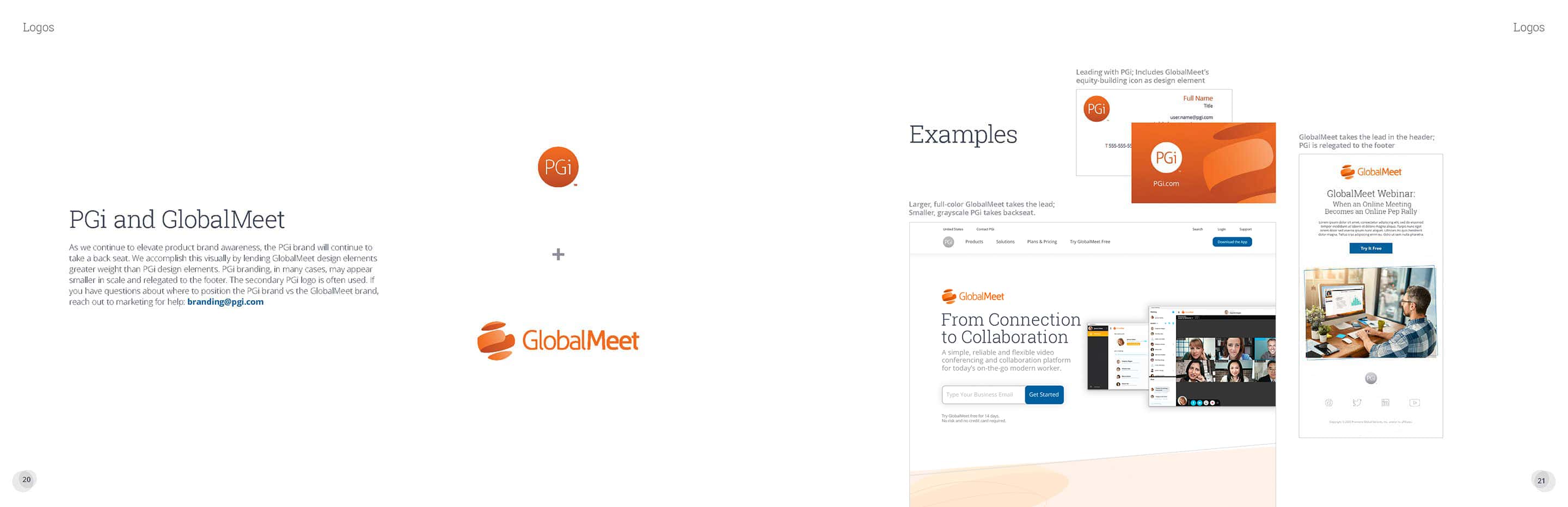
1. Defining the relationship to PGi
The first decision was structural, not visual. We had to define how GlobalMeet related to PGi in different scenarios: PGi-led communications where GlobalMeet appears as a flagship product, product-centric moments where GlobalMeet leads and PGi endorses, and neutral, systems-level layouts where both marks appear with equal weight.
I mapped these scenarios and defined a co-branding hierarchy that covered spacing, lockups, and recommended usage across marketing and product surfaces. That hierarchy became the backbone for how teams combined the logos in real work and was later captured in the PGi Visual Identity Guide.
2. Redesigning the mark
With the architecture in place, I explored logo directions that simplified the form for small sizes, connected to PGi’s refreshed color and geometry, and supported a flexible symbol-plus-wordmark structure. The chosen mark was refined using real contexts—product mockups, slide templates, and sponsorship layouts—so we could see how it behaved under typical constraints rather than in isolation on a white artboard.
3. Building the co-branding system
Once the mark was approved, I formalized co-branding patterns that answered the practical questions teams asked most: how to pair PGi and GlobalMeet in horizontal vs. vertical lockups, how much clear space each needed, how to handle sizing and alignment, and when to lead with the corporate brand versus the product brand in decks, one-pagers, and campaigns.
These rules were delivered with clear visual examples and integrated into the broader PGi brand system so teams could quickly see what “correct” looked like in context.
4. Extending into motion and UI
To support product demos, webinars, and sponsorship content, I helped create an After Effects toolkit centered on the new identity, including animated logo builds, basic transitions, and lower-third and title treatments that followed the updated visual system.
In parallel, I worked with product and web teams to bring the mark into navigation, hero surfaces, and UI elements. The goal was to make the GlobalMeet identity feel continuous—from the homepage to the in-product experience—rather than like a separate campaign logo.
Impact
The redesigned GlobalMeet logo and co-branding system clarified how PGi and its flagship product show up together across product, marketing, and sponsorship channels. It reduced back-and-forth on logo usage for global teams, strengthened the perceived connection between GlobalMeet and the corporate brand, and provided a motion- and UI-ready mark that scaled from app icon to LED wall.
Most importantly, the work didn’t ship as a one-off logo refresh. It became a core piece of the PGi Enterprise Brand System, giving teams a dependable way to represent the flagship product wherever it appeared.
Motion system: logo builds, title cards, and lower-thirds designed for demos, webinars, and events.