UPS Annual Investor Conference
Art Direction
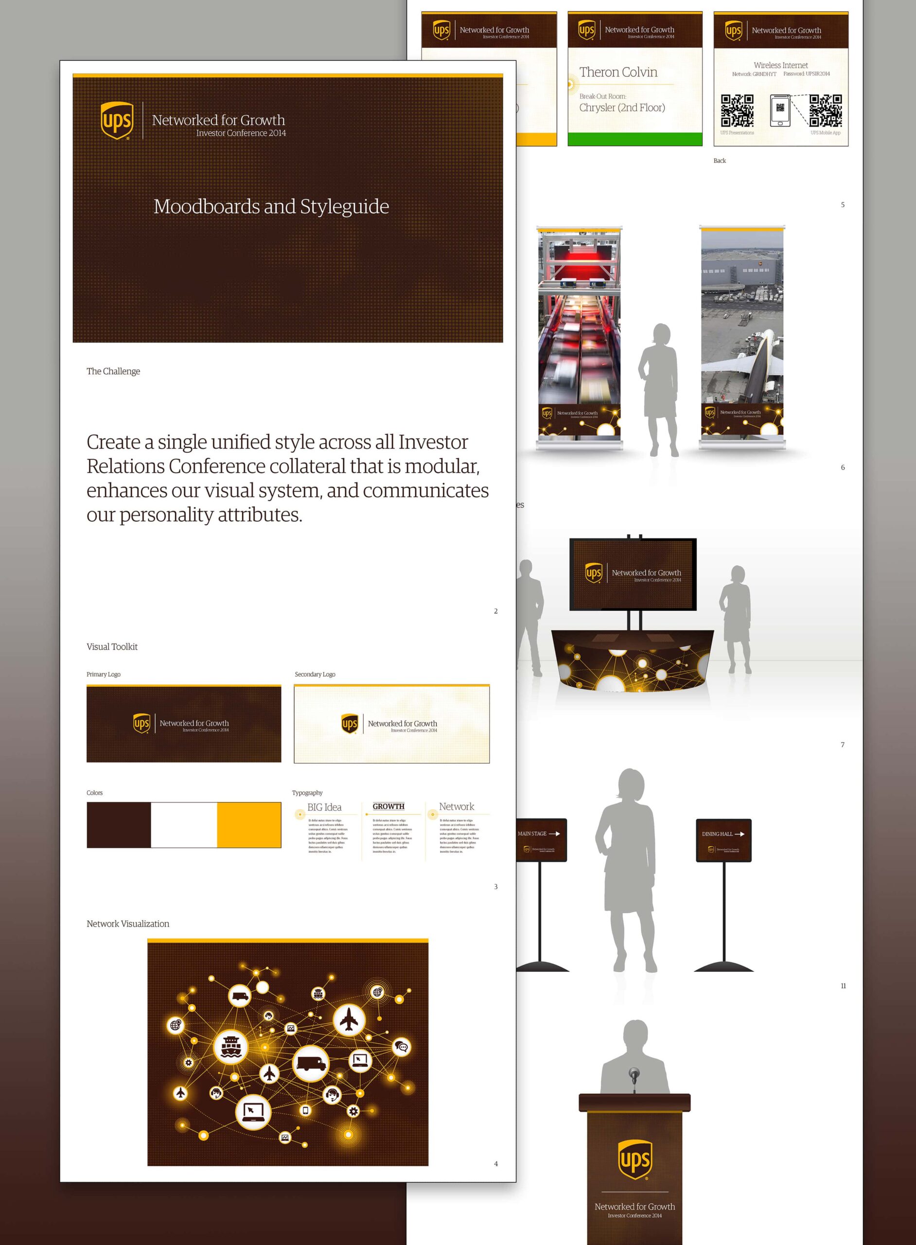
Challenge
To create a single unified style across all Investor Relations Conference collateral that was modular, enhanced our visual system, and communicated our personality attributes.
Solution
To establish consistency across all Investor Relations Conference materials, I began by developing a series of mood boards exploring color, typography, imagery, and layout direction. These were refined through collaborative reviews to ensure alignment with brand personality and event goals. Once the unified visual direction was approved, I translated it into a comprehensive style guide detailing type hierarchy, grid systems, iconography, and color usage. The guide was then distributed to internal teams and external partners responsible for developing event collateral, ensuring all assets followed the same cohesive aesthetic.
Result
The finished site provided Casey with a professional, multi-purpose portfolio that communicates her creative range in a cohesive way. Visitors can now explore her writing, artwork, and music seamlessly from any device, helping her share her work with a wider audience and establish a consistent digital home for all future projects.